GROWER
The site of a former Mastercard, UBS and Le Pain Quotidien executive who now mentors CEOs. It had to sound like him: direct, discreet, nothing that reads like a consultancy.
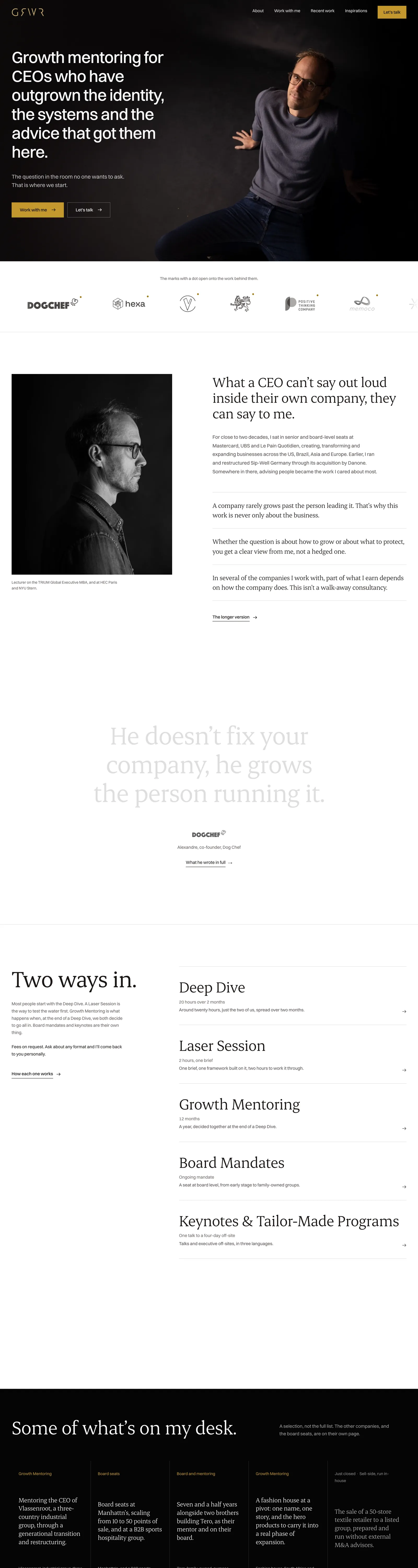
grwr.coLive
The brief
GROWER sells one thing: a conversation a CEO cannot have inside their own company. The people who buy it read a site in thirty seconds and decide whether the person behind it is serious. The old site was a template with stock photos, and the name GRWR meant nothing to anyone who had not already met him.
What we did
We made the name the idea. GRWR is GROWER without its vowels, so the stencil mark opens into the full word the first time you arrive. Around it: studio portraits on ink, one serif, generous white pages, and the proof he actually has. Real recommendations from LinkedIn, the companies he sits with, the books that shaped him. Every sentence was rewritten with him until it sounded like a conversation, not a brochure.
- Art direction and the animated mark
- Copywriting with the client
- Eight pages, five service formats
- Contact form delivered to his inbox
- Domain, mail and hosting migration
On a phone
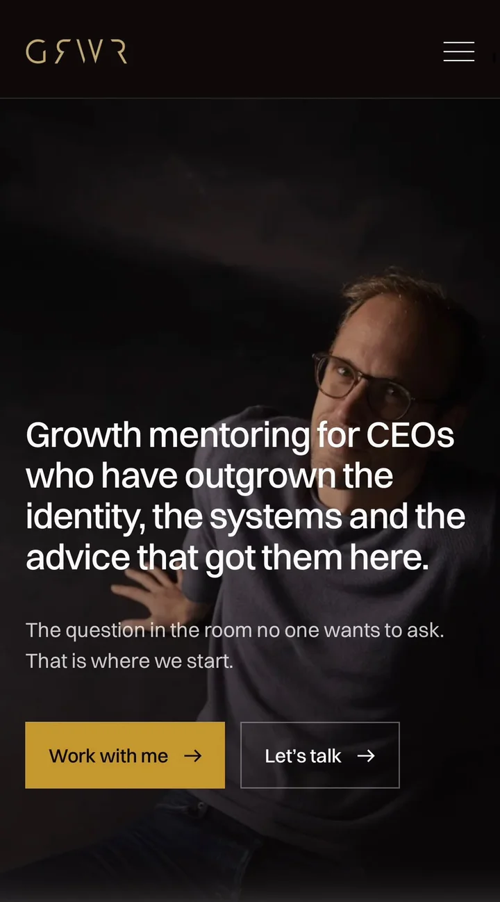
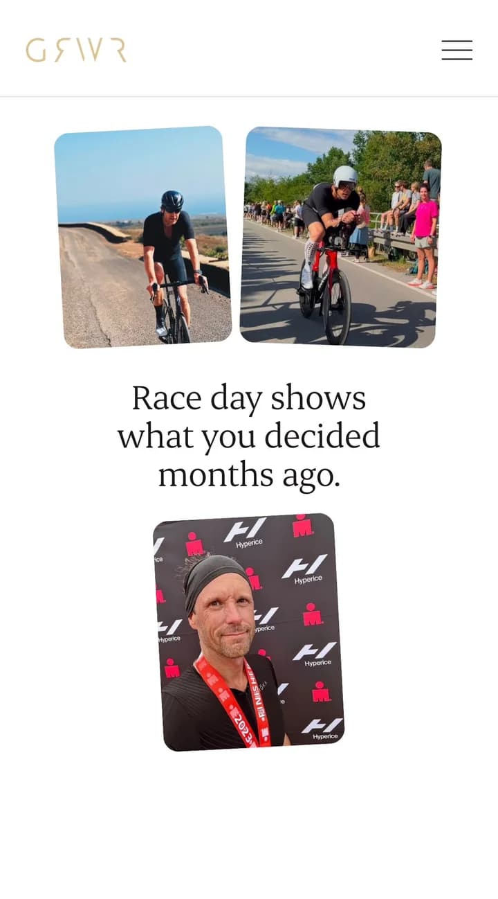
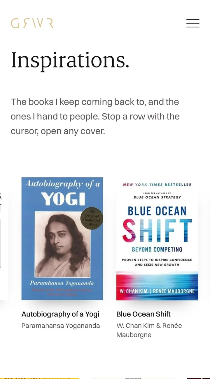
In detail
A name that explains itself
The intro plays once per visit: four stencil letters, the O and the E slide in, GRWR becomes GROWER. The footer does it again as you scroll to the end.
Proof, not claims
No invented numbers anywhere. Recommendations are his real LinkedIn ones, opening in full over the page. Client logos lead to the work behind them.
Built to be left alone
Static pages on Vercel, no tracking, no cookie wall. The contact form sends through Resend on his own domain.